Another letter design similar to the "A" i done earlier. The "A" was a bit overboard for me as for color and details. This one is only black and white which i like more. I know neon signs dont look this complex but i just love adding small and settle details, consider it a futuristic neon sign heh. This piece was a test. I hope to create this effect with a whole word soon.
Saturday, June 30, 2012
Thursday, June 28, 2012
Patriots
another type piece. Spent about 4 hours on it. Don't know what to say about it really. Inspired by Metal Gear again heh. Long story short: Patriots are like the Illuminati of the MGS story and "AI" is selected in the piece because the Patriots are run by AI. bye
alt colors
close up
Monday, June 25, 2012
letter A
hey
Here is a quick design i just came up with. It was suppose to be a simple "A" neon sign but went a bit overboard with it and it became futuristic armor thing
Here is a quick design i just came up with. It was suppose to be a simple "A" neon sign but went a bit overboard with it and it became futuristic armor thing
Friday, June 22, 2012
T1
hey...
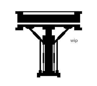
been working on this T1 piece all night long. A lot of trial and error in this design. Moving shapes endlessly was a pain but im very happy how it came out. I was going to just be a T by it self but i just wanted "1" because it i wanted to play around more with the "industrial"style, so the T1 word doesnt really have no meaning.
Also the more i look at it, its like a space rocket launch pad heh.
sleep now
Wednesday, June 20, 2012
haven
hey
Been playing around again with tech/sci fi type. word is Haven from Metal Gear Solid, Outer Haven. I wanted the word to be "sucked in" or teleported with a hint of techiness lines. Took a while to create all the lines and stuff heh
process:
Been playing around again with tech/sci fi type. word is Haven from Metal Gear Solid, Outer Haven. I wanted the word to be "sucked in" or teleported with a hint of techiness lines. Took a while to create all the lines and stuff heh
process:
Monday, June 18, 2012
max payne
just recently beat Max Payne 3. Great action game, basically shooting people non stop heh. Also big fan of MP1 and MP2.
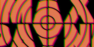
Max Payne 3 had a tv scan effect during the cut-scenes. I thought it was pretty cool and captured Max's mental and alcohol problems.
So i just decided to do a title card for the game. Basically just using the cross hair shape...blah blah blah heh. It was pretty cool playing with photoshop to get the tv scan effect like in the game. later.
Friday, June 15, 2012
typography stuff
Hey
Just playing around with a different style of typography. Kind of got hooked into this style of design when i designed the Kill Bill logo. I like the "POW!" it gives when you see it. I guess it's has like a comic style to it.
Also i been chosen to do a typographic design for a gallery, which is cool. I'll keep blog updated about it. Not sure what i will do next. I might do some more sci fi / tech based designs. My goal is try to pump as much work as possible to get some more jobs.
So far 2012 is the best year so far since my 5 years of doing this, just hope it gets better.
Wednesday, June 13, 2012
nike hologram

final

Here is a quick design i just did. Nike logo obviously with some some random gradient madnesss. Just playing around something outside my comfort zone. I dont really use photoshop that much besides for cropping and adding some noise.
I think this design is pretty cool but i didnt really think about the design, its was all happy incidents. heh
Might do more stuff like this in the futre...not sure if im really digging this style.
As for the Kill Bill opening credit thing, its too much work for me. Designing logos for each member of the movie. I might do it in the future.
Also might do freelancing for another clothing brand. Got email they liked my work. Really hope i get this. I need more jobs to keep me busy.
Tuesday, June 12, 2012
kill bill
i’m a big fan Kill Bill, i always wanted to redo the simple opening credits. I wanted to add some more “flare” to the design. I’m planning to design some custom lettering for the title, production team and actor/actress with their nick names too. here are some quick sketches.

Here is my my sketch i end up using as the Kill Bill logo. logos i need to work on now are the Deadly Viper Squad and their members. Stay tuned.

comp for the opening credit

Subscribe to:
Comments (Atom)


